LUPMIS - GIS User Manual for Land Use Planning
Main menu:
- Home Page
- 0. Rationale
- 1. GIS handling
- 2. GIS data entry
- 2.1 Create new layer
- 2.2 Digitize line
- 2.3 Digitize point
- 2.4 Digitize polygon
- 2.5 Edit existing layer
- 2.6 Delete feature
- 2.7 Split line
- 2.8 Split polygon
- 2.9 Merge lines from different layers
- 2.10 Unite lines
- 2.11 Snap lines
- 2.12 Join polygons
- 2.13 Extend polygon
- 2.14 Insert island
- 2.15 Define unit surrounding islands
- 2.16 Create 'doughnut'
- 2.17 Fill 'doughnut' polygon
- 2.18 Fill polygon with 'holes'
- 2.19 Digitize parcels from sector layout
- 3. GIS operations
- 3.1 Create buffer
- 3.2 Create exclusion zone
- 3.3 Overlay units
- 3.4 Convert line to polygon
- 3.5 Derive statistics (area size, length)
- 3.6 Clip unit according to other unit
- 3.7 Create geographic grid
- 3.8 Move entire vector map
- 3.9 Move or copy individual features on a map
- 3.10 Adjust polygon to line
- 3.11 Convert points to polygon
- 3.12 Define by distance
- 4. Attribute database
- 4.1 Start with database
- 4.2 Import database
- 4.3 Display database information
- 4.3 Retrieve database information
- 4.4 Enter attribute data
- 4.5 Attribute matrix of multiple layers
- 4.6 Seeds
- 4.7 Repair attribute data
- 4.8 Merge lines with attached database
- 4.9 Transfer attribute data from points to polygons
- 4.10 Copy styles, labels, attributes
- 5. Conversion of data
- 5.1 Points
- 5.1.1 Import list of points from text file
- 5.1.2 Import list of points from Excel file
- 5.1.3 Convert point coordinates between projections
- 5.1.4 Convert point coordinates from Ghana War Office (feet)
- 5.1.5 Convert point coordinates from Ghana Clark 1880 (feet)
- 5.1.6 Track with GPS
- 5.1.7 Download GPS track from Garmin
- 5.1.8 Download GPS track from PDA
- 5.2 Vector maps
- 5.3 Raster maps
- 5.4 Communication with other GIS programs
- 5.4.1 Import GIS data from SHP format
- 5.4.2 Import GIS data from E00 format
- 5.4.3 Import GIS data from AutoCAD
- 5.4.4 Export LUPMIS data to other programs
- 5.4.5 Export GIS to AutoCAD
- 5.4.6 Change a shape file to GPX
- 5.4.7 Transfer GIS data to other LUPMIS installations
- 5.4.8 Digitize lines in Google Earth
- 5.5 Terrain data
- 5.1 Points
- 6. Presentation
- 7. GIS for land use planning
- 8. Database
- Annexes
- A1. Map Maker setup
- A2. Background to cartography and raster images
- A3. Glosssary
- A4. Troubleshooting
- A5. Styles
- A6. Classification for land use mapping and planning
- A7. GIS utilities
- A8. Map projection parameters
- A9. Maps in pilot areas
- A10.Standards
- A11. LUPMIS distribution CD
- A12. Garmin GPS
- A13. Training
- A14. ArcView
- A15. Population statistics
- A16. Entry and display of survey data
- A17. External exercises
- A18. MS Access
- A19. Paper sizes
- A20. Site map and references
4.3 Retrieve database information
4. Attribute database
4.3 Retrieve Database Information
Level of expertise required for this Chapter: Intermediate
After short introduction, there are 6 subchapters to explain different features to retrieve database information:
A) To display figures on-hit
B) Display of figures in map
C) Display of graded colour scheme
D) Display of charts
E) Display of pie charts with variable sizes
F) Display of circles with variable sizes
G) Alternativ display of circles with variable sizes
If you have a database attached to the GIS file (see Chapters 4.1 and 4.2), you can easily set up Map Maker to display the stored information by clicking on the particular mapping unit.
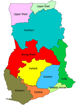
For example: File Ghana_regions_popdata with standard display labels (names of regions) and standard styles:
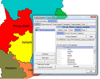
If you want to see more data for each region, you have to call the database (DBF file) and attach it to the graphics (DRA) file:
Right-mouse > Project manager window: Data link > Database > Choose database > Select folder and file (here: Ghana_regions_popdata.dbf) > Open
The link column is recommended to be always ID
- - - - -
A) To display figures on-hit:
Still in the Project manager window, under the Data link tab: On hit > Tick: Make layer hit-able with the data query tool > Database. You can now take data fields out, which you do not want for display. For example:
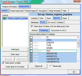
Close the Project manager window (OK)
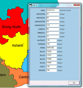
Click the Data-tool on the toolbar left, then on the requested region, and a window will show all information available for this region:
- - - - -
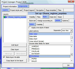
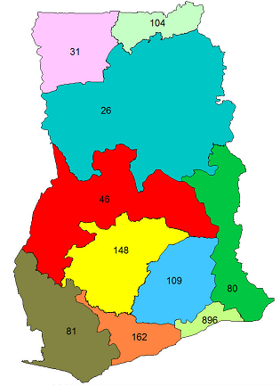
B) Display of figures in map:
You can display figures of one requested data set on the map, in this example, population density by region.
Back to the Project manager window: Style > Labels > Options > Data value > Select the data field, you want for display, here: Popdens > OK
As requested, the population density figures are displayed for each region:
- - - - -
C) Display of graded colour scheme:
You can display the map with graded colours for the specified data field.
Back to the Project manager window: Style > Assign according to > Database > Data column > Select the data field you want for display (here: MATMORT) > Filter data in ... >

> New filter > Select folder > Specify a new file name for the filter (= colour grade definition, which you will create now, e.g. 'filter1') > Save (If you have created such a filter before, you can Choose filter) > OK >
> Data bands window: Filter > Apply filter to: Polygons only > Tick: Use polygons colours rather than styles> Tick: Graded colours > Bands: 2 > Click on the gray/colour boxes below Fill colour to select the colour range (recommended: Dark colour for the upper box, light colour for the lower box) > OK > OK

Note 1: In specific cases, you might use also 3 bands with an intermediate colour.
Note 2: If graded colour is not visible or is not enabled, you have to check and make sure, that the numbers for the gradient are numeric, in the original spreadsheet.
The graded colours map should look like this:

- - - - -
If you want the colour scheme not graded, but assign individual colours, you can do so: Remove the tick from Graded colours > Check or assign individual colours > Test different options with different bands:

- - - - -
If you work with individual colour assignments for different classes, you might be interested in the definition of the bands, i.e. the assignment of colours to numeric values of the database. You find these under Numerical bands(1, see below).

You can change the band limits by clicking on the drag button and drag it up or down (2).
If you the lower limit does not show correctly on your map, you should reduce the lower limit by 1 (3).
Note 3: It is always what is displayed under this Numerical bands, not under Filter, what is then used for the calculation of the map.
D) Display of charts:
You can display charts on the map representing figures of the database.
You start in the same way as explained above, i.e. including the database with numeric values for the percentage distribution of each pie chart. (If the database is not loaded, you have to load it: 'Choose database', see steps 1-3 of Chapter 4.2).

In Map Maker: Check that the values for the display in the loaded database are numbers by Project manager > Data link > Database: The left column must show 'integer'. If not, change the table (for example, in MS Excel). Also, check that the ID in the DRA file and in the source table match each other.
Then:
From the Project manager window: Style (1, see below) > Labels (2) > Option (3) > Data chart (4) > Select the data field (or fields) you want to display (5, here: MAL01, MAL02, MAL03, MAL04) > Data chart (6) >

> Select chart type (here: Histogram) > If required: Adjust 100% range and size of chart > OK

The histogram chart should look like this:

A pie diagram chart can look like this:

To create a small additional legend, as shown on the histogram chart above:
After you have selected the type of diagram (in example above: Histogram) and possibly edited the chart colours: Make legend > Make legend window: Size and title > Change size, font, colour if required > Labels > Enter short, but descriptive labels > Preview > Save to EMF file > Enter file name for EMF file > Save, and proceed as described above.
You call this EMF file through map furniture: Right-mouse > Map Furniture > Locate box on map, where the legend should be placed > Map furniture window: Furniture type: Enhance Metafile > Select EMF file, just created > Open > OK
(See also Chapter 6.3.1 for more descriptions on map furniture).
- - - - -
E) Display of pie charts with variable sizes:
- 1. You have a column in your source table, which indicates the size of each pie chart, as shown in the sample table in part D as the rightmost column. You can call this column Size or similar.
- 2. You proceed as explained in previous part D (Display of charts): From the Project manager window: Style > Labels > Option > Data chart >
(If the attribute file (XLS) has not been loaded yet: Choose file window: Select XLS file > Open > Choose link column window: ID > OK) >
Select the data field(s) you want to display > Data chart > Pie chart > Size of chart: You must enter Size (i.e. the column name, as defined before) > OK.

The result will look similar to that:

Note: This requires Map Maker version 19 September 2009 or later.
More examples at end of Annex 15.1 and Annex 15.2.
F) Display of circles with variable sizes:
The display of circles with variable sizes is very similar to the process above:
- 1. You have a column in your source table, which indicates the size of each pie chart, as shown in the sample table in part D as the rightmost column. You can call this column Size or similar.
- 2. Have also a column with 1s (cell in each row with value 1). You can call this column Dummy or similar (see Excel table in Annex 15.2 for an example).
- 3. You proceed as explained in previous part D (Display of charts): From the Project manager window: Style > Labels > Option > Data chart >
(If the attribute file (XLS) has not been loaded yet: Choose file window: Select XLS file > Open > Choose link column window: ID > OK) >
> Select 'Dummy' (as defined before) > Data chart > Pie chart > Size of chart: You must enter Size (i.e. the column name, as defined before) > OK.
Examples at end of Annex 15.1 and Annex 15.2.
G) Alternativ display of circles with variable sizes:
To avoid the vertical line inside the circle and to have easier control over the size of the circles, you can use following alternativ approach:
- 1. You have a column in your source table, which indicates the size of each circle, as shown in the sample table in part D as the rightmost column. You can call this column Size or similar.
You don't need a column 'Dummy'.
- 2. You proceed as explained in previous part D (Display of charts): From the Project manager window: Style (1) > Labels (2) > Option (3) > Data chart (4) >
(If the attribute file (XLS) has not been loaded yet: Choose file window: Select XLS file > Open > Choose link column window: ID > OK) >
> Select data column ('Size' or similar, 5) > Data chart (6) >

> Single value percentage spot (7) > Size of chart: You can enter any appropriate size (8) > OK (9).

The result can look like:


Sub-Menu:
- 4.1 Start with database
- 4.2 Import database
- 4.3 Display database information
- 4.3 Retrieve database information ←
- 4.4 Enter attribute data
- 4.5 Attribute matrix of multiple layers
- 4.6 Seeds
- 4.7 Repair attribute data
- 4.8 Merge lines with attached database
- 4.9 Transfer attribute data from points to polygons
- 4.10 Copy styles, labels, attributes